
- Client: Maude
- Year: 2020
- Tags: Web Design, Development
The modern sexual wellness company, maude, approached us to help expand their online magazine, the maudern, into a more robust and engaging platform to house their newly expanded content family. We designed and developed a new content platform that tightly integrates with their ecommerce site, and builds upon the brand's already strong visual presence.
A Growing Content Family
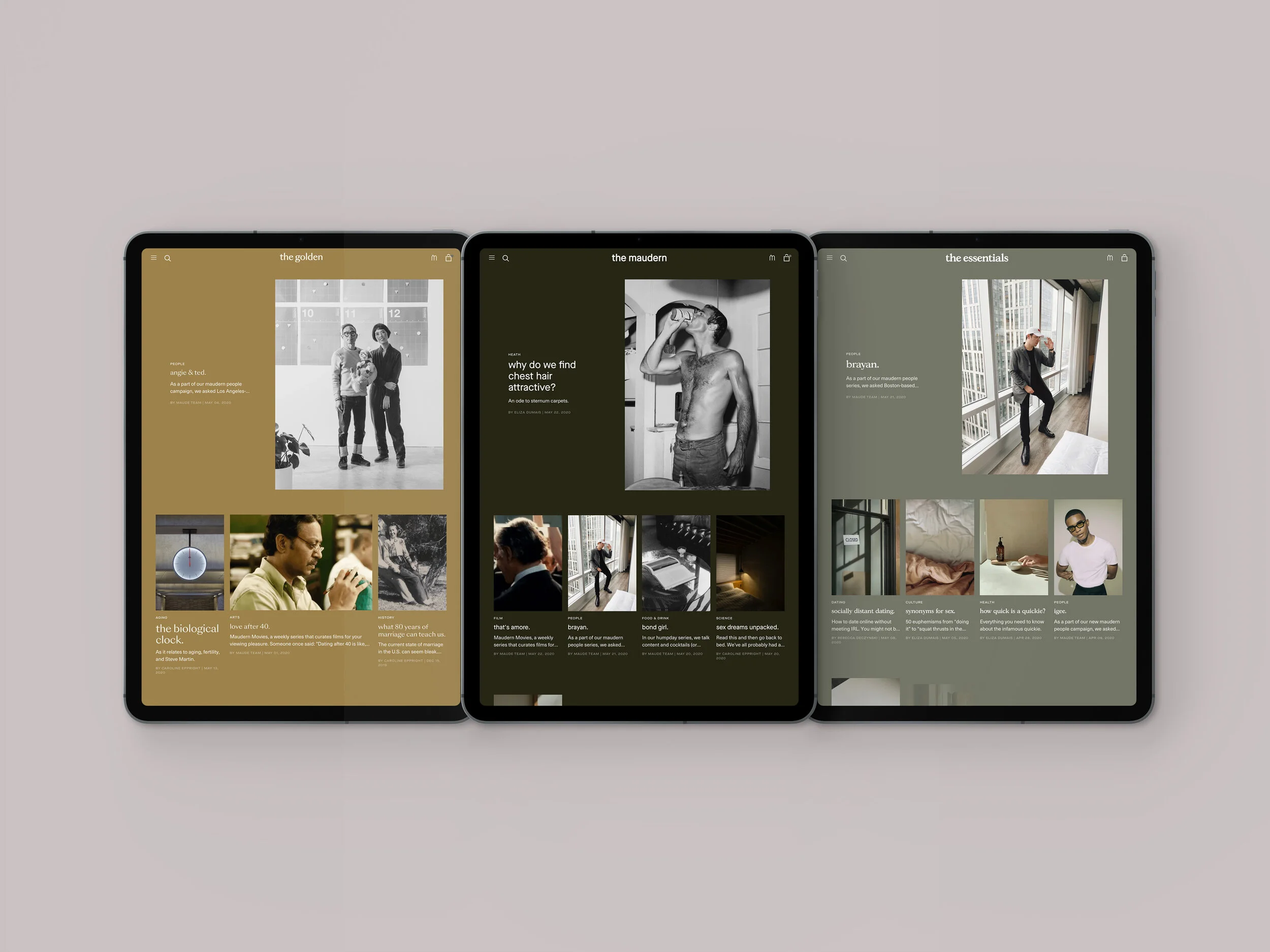
The maudern is on a mission to normalize conversations about sexuality. Recognizing the diverse needs of the different age groups in their readership, maude decided to expand the maudern into separate verticals, each with a unique identity, and each offering topics that would be germane to different groups. The maudern explores modern intimacy through arts, science, and relationships; the essentials is aimed at covering the basics of sex ed, culture and navigating dating; and the golden focuses on health, changing bodies, and getting older with a partner.
We maintained a steadfast focus on mobile-first and progressive enhancement philosophies when designing and developing the new version of the maudern, ensuring the bold photography and content will shine on the smallest devices while allowing for more complex and visually engaging layouts on larger devices.
A Close Relationship
After exploring a number of options for how to best implement the new platform, it was decided that the best approach would be to build the maudern on the same platform as maude's ecommerce site, which is on Shopify Plus. This tight integration allowed for some key benefits, such as the ability to more closely incorporate shoppable products into content and making it easy to navigate back and forth between the maudern and the ecommerce site. On the other hand, it produced some challenges that needed to be overcome, both on the design and development side. The visual identity that we created needed to be unique enough to stand on its own and feel distinctly separate, but also be cohesive enough with the established branding to avoid a disconnected experience when navigating between the sites.
Featured


